Junior Volleyball Association
The Junior Volleyball Association (JVA)’s mission promotes the growth of youth and junior volleyball. It achieves this through program and resource development, education and events.
While JVA successfully and rapidly supported the growth of youth volleyball, its website lacked the content structure to effectively keep up with expanding programs and resources.
Enter Flipeleven! Through the website redesign, we not only completed an information architecture overhaul – we also refreshed their brand to better reflect the strong, active association that JVA is today.
INDUSTRY: Sports
LOCATION: Wisconsin
Branding
Using the three letters JVA had become recognized by, we worked on creating a unique and strong wordmark. Then, completing the look with bolder, modern colors.
Information Architecture
Restructuring site content, giving users easier access to JVA’s core offerings, including their ever-growing library of resources.
Results
A scalable content structure that resulted in increased traffic to JVA’s core resources.
A Brand That Hits Harder
JVA used its initials as a logo since being founded as a girls’ youth volleyball association in 2006. Since expanding to support boys and beach programs, the association needed a new look. It needed to be less delicate and more bold, making an impact like a facial off of a perfect set.
F11P stuck with the letters JVA was known for, but increased the weight to make it stronger. We designed the “J” to be less literal and more like a swish or swinging motion, better representing movement in the sport. Combining JVA’s new mark with more vibrant colors gives the brand a modern feel, reflecting the attitudes of all its athletes.

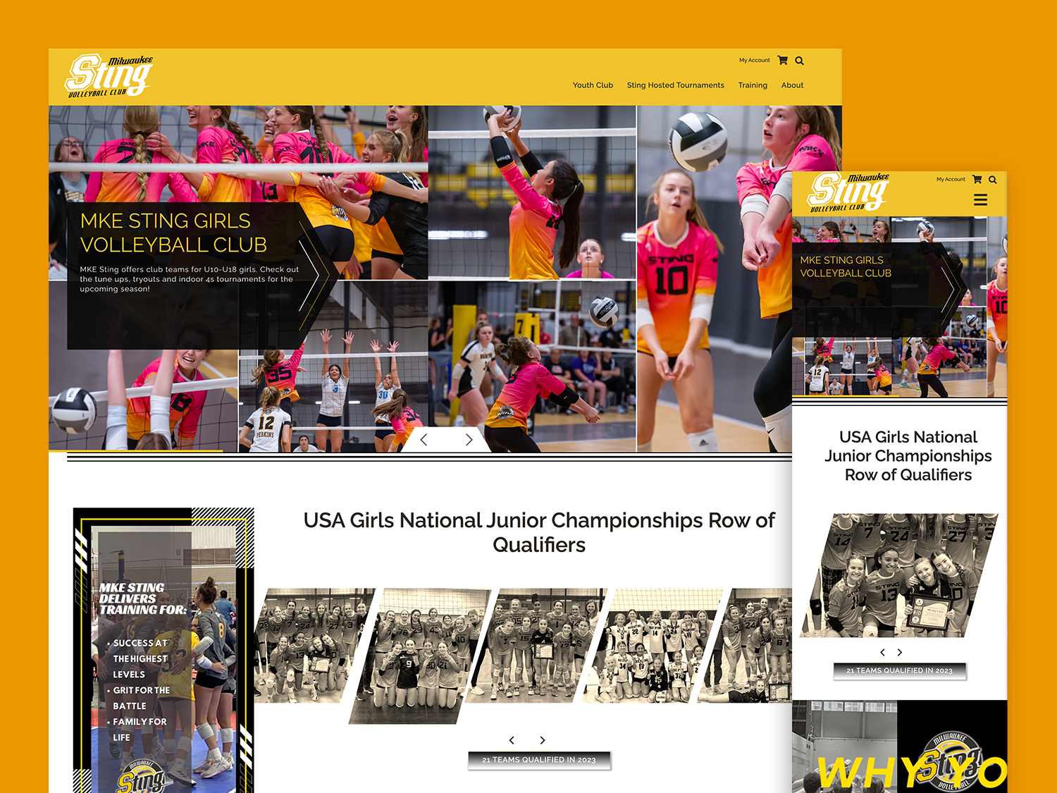
Developing a Website Content Structure FOR the Audience – Not Based on Them.
JVA knew who their audience was – volleyball clubs, coaches, players, and parents – and built the main navigation of their old site based on that. However, delivering content to each of these segmented groups became complicated and confusing. Many of the users needed the same content. This created duplicate links and repeated pages, while burying JVA’s useful resources under multi-level dropdowns.
JVA users weren’t actually reaching the important members-only content that they were publishing. They needed a better site architecture.
We “F11P’d” the site structure, improving the user experience. Prioritizing JVA’s content groups based on their goals, and the goals of their users. Then, developing a new sitemap and navigation more clear and scalable. The new main navigation removed previous extra steps and brought the types of content JVA offers to the forefront.
Community Management and Members-Only Content
The new website needed to connect with JVA’s member management software and seamlessly serve up access to gated content when members were logged in. We integrated Netforum, their association management software, with the WordPress site, and synced logins to give JVA members easy access to all their resources on the site.
On members-only content, we tease the content if the user isn’t logged in, giving them the option to log in right on that resource or join the JVA. Non-members get a taste of what they are missing, creating a value-added JVA membership call-to-action.


The results
The success of the new website is reflected in the analytics, with traffic to JVA’s core resources pages increasing by 50% and the overall pages per session increasing by nearly 40%.
With a refreshed look and a more user-friendly site, JVA has solidified its position in youth volleyball (setter, obviously) and it continues to be the go-to resource association for junior volleyball clubs.
Take the next step in your digital project
Contact us to inquire about your project or just to say hello! Fill out the form and we will get back to you in 24 hours or give us a call at (414) 369-2112
"*" indicates required fields