Welcome to the captivating world of graphic design, where creativity takes center stage. Behind every visually stunning masterpiece lies a set of essential principles that form the backbone of exceptional design. Today, we’ll dive into the core principles of graphic design, unraveling the secrets of emphasis, balance, alignment, repetition, unity, variety, proportion, and white space.
1. Emphasis: Guiding the Eye
Emphasis is all about directing the viewer’s gaze. By using contrast, size, color, or placement, designers create focal points that draw attention to essential elements. It’s like guiding someone’s eyes to the heart of the design, ensuring they grasp the central message effortlessly.

The color in these images provides emphasis. Image via WebDesignDev
2. Balance: Achieving Harmony
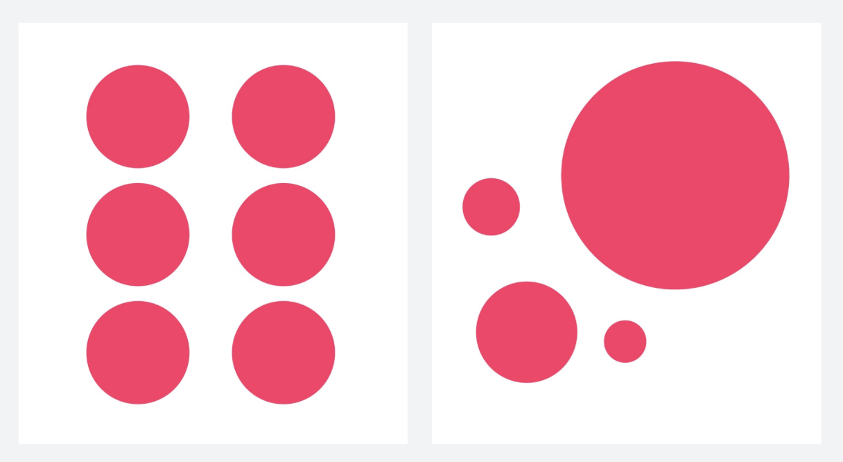
Keeping a sense of balance in a design is crucial for visual harmony. There are two types of balance:
Symmetrical balance involves mirroring elements across a central axis, resulting in a formal and structured look.
Asymmetrical balance involves unevenly distributed elements, yet the design retains stability and visual interest. Asymmetrical balance allows for more creativity and dynamic compositions.

The left side of the image provides symmetrical balance, the right side of the image provides asymmetrical balance. Image via invision
3. Alignment: Bringing Order
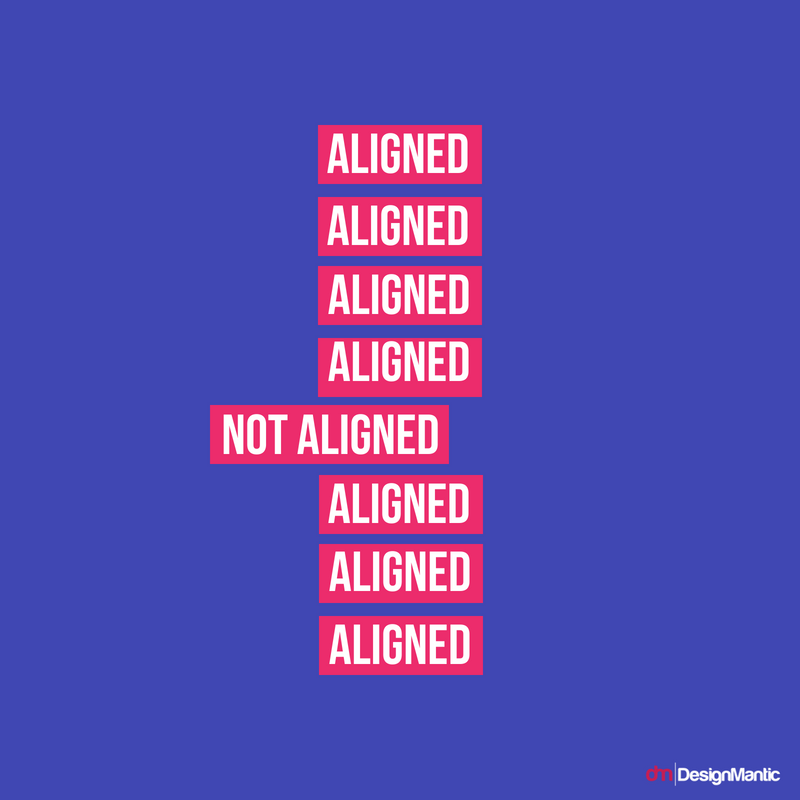
Alignment helps create order and organization in a design. By positioning elements precisely in relation to each other, designers establish coherence and structure. Consistent alignment aids the viewer in understanding the content easily.

This image is an example of alignment. Image via DesignMantic
4. Repetition: Building Consistency
Repetition reinforces branding and visual consistency. By repeating design elements, such as colors, fonts, or patterns, designers create a unified identity that strengthens the overall message. Think of using a repeated motif to tie the design together.

This image is an example of repetition. Image via graphicszoo
5. Unity: Ensuring Cohesion
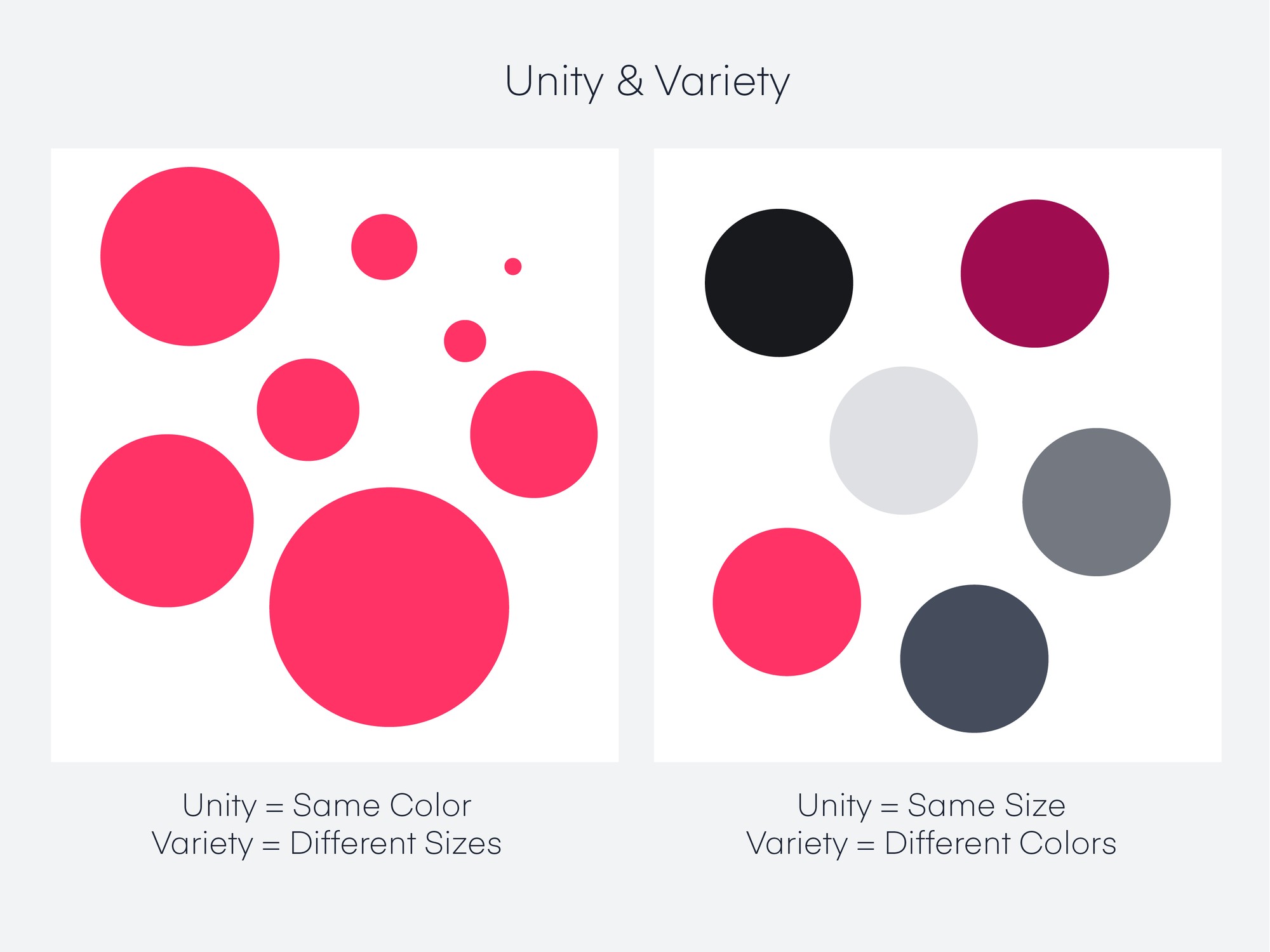
Unity is about making all design elements work together harmoniously. It creates a seamless and polished composition that conveys a clear message. A design executed using this principle is more memorable. Cohesion can be created using size or color.
6. Variety: Adding Interest
While unity is crucial, too much sameness can lead to a dull design. Variety introduces diversity and excitement. Skillfully using different fonts, colors, or textures helps create focal points and adds interest to the composition.

This image shows the difference between unity and variety. Image via invision
7. Proportion: Visual Balance
Proportion governs the size relationships between design elements, ensuring a visually pleasing layout. By following simple ratios, designers create compositions that are visually satisfying. When the golden ratio is being used, the sum of two elements are equal to their sum ratio of the larger element. Consistent use of proportion in design helps reinforce a brand’s identity. Proportions for logo placement, color usage, and typography can become recognizable visual cues associated with the brand. In digital marketing, proportion can impact conversion rates. By using proportion to highlight important conversion elements (such as buttons or forms), marketers can potentially increase the likelihood of users taking desired actions.

This image shows proportion in design, making the number 8 larger than the other elements. Image via Canva
8. White Space: The Pause
White space, or negative space, is the blank area surrounding design elements. It enhances readability, emphasizes key elements, and allows the design to breathe. Whitespace serves as a vital design element, guiding the viewer’s gaze, arranging content, and providing cognitive rest. This element significantly enhances content legibility and cultivates focus and attention.

These images are an example of white space. Image via Inzone
Wrapping It Up
As designers, understanding and applying these fundamental principles unlock the gateway to exceptional graphic design. Emphasis, balance, alignment, repetition, unity, variety, proportion, and white space are the building blocks of a visual language that communicates effectively. By using these principles thoughtfully, designers can create impactful and beautiful designs that leave a lasting impression. So, let the principles guide your creative journey, and may your designs resonate with your desired audience. Happy designing!
Contact us to spice up your brand’s content!
"*" indicates required fields


